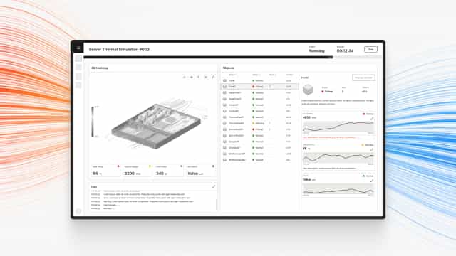
The Design Challenge of Anomaly Monitoring
Fans, pipes, and heat sinks in the thermal experiment each carry several monitored metrics. What I had to work out was how to organize all of that so engineers could take in the full picture at a glance.
Anomaly Triage
With multiple objects monitored at once, how do you help engineers spot an anomaly at a glance instead of scanning every value one by one.
Information Density
Each object has several metrics. How do you show them all on one screen without causing cognitive overload.
Version Switching
Handling an anomaly means switching the object's version and re-running the experiment. The interface needs to make clear which version was switched to and what changed.
The scenario:
Design a dashboard for a thermal simulation experiment that lets engineers quickly locate the problem object, switch its version, and re-run the experiment when something goes wrong.
Information Architecture
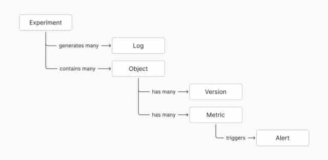
The first step was mapping out the relationships between data entities and sketching the data fields, as the foundation for the interface design that followed.
- An Experiment contains multiple Objects
- Each Object has multiple Metrics and multiple Versions
- When a metric exceeds its threshold, it automatically triggers an Alert
- The experiment's execution status is tracked separately as a Log
Layout Decisions
Once the information architecture was settled, I put those entities and fields on screen. I used a bento-box layout logic: the more important the information, the more space it gets and the more prominent its position.
In a thermal simulation scenario, the 3D heatmap naturally becomes the focal point. With that principle set, I evaluated a few options:
Option A: Heatmap, Key Metrics, and Object in Three Equal Blocks
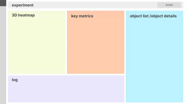
The 3D heatmap sits on the left, key metrics in the center, and the object block on the right. The three sections map onto the three entities in the information architecture, which makes the structure easy to read.
But later design work showed the object block carried the most information. Placed in an equal section, it would require frequent switching, so I didn't go with this option.
Option B: Heatmap and Key Metrics Merged, Object Block Enlarged (chosen)
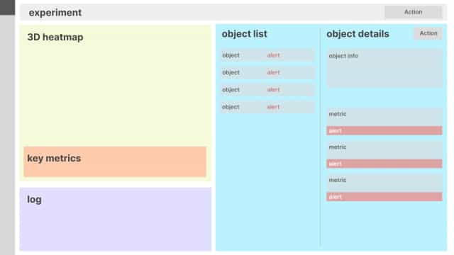
Folding key metrics into the heatmap block on the left frees up space to enlarge the object block, which now holds the object list and detail together. Everything can be reviewed without switching back and forth.
A monitoring interface should keep key information visible at the same time, cutting down on switching so engineers can judge faster.
Anomaly Display
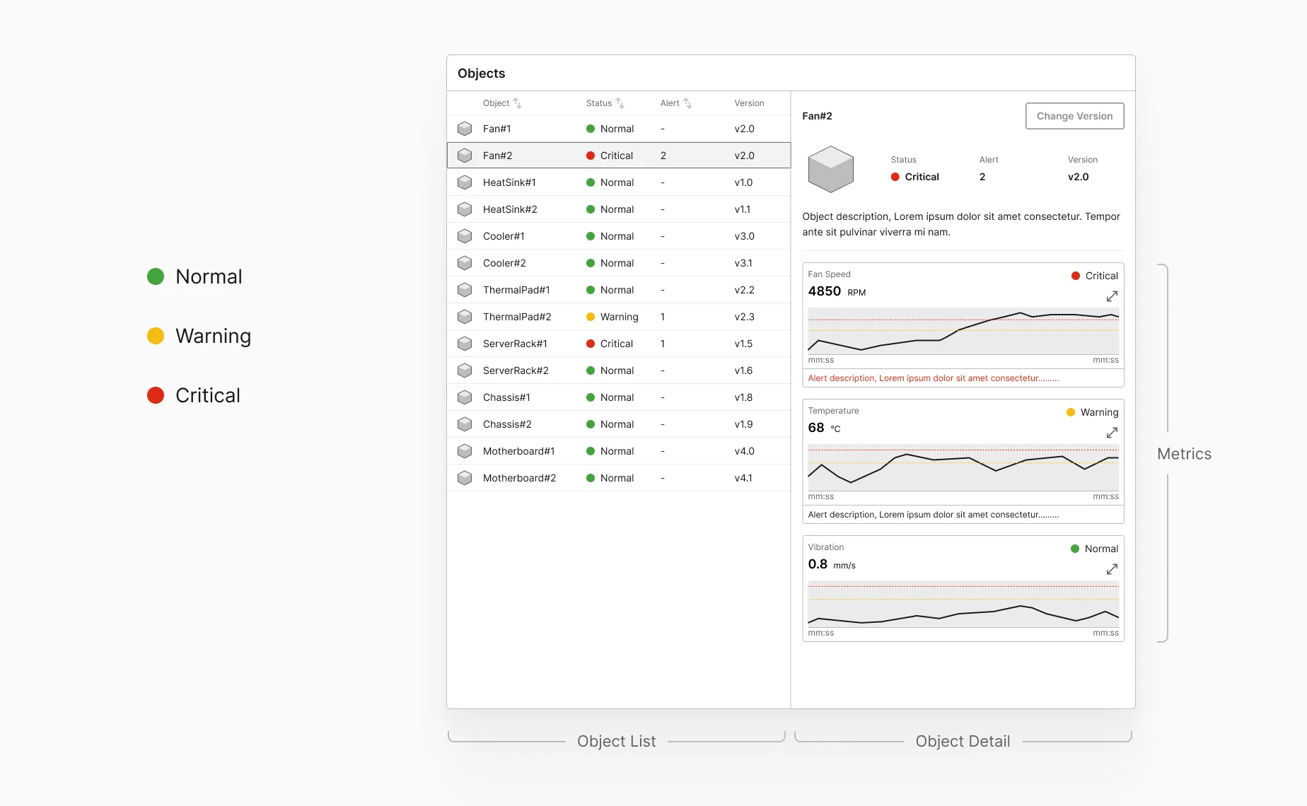
I defined three severity levels for an object's state, normal, warning, and critical, so engineers can judge how urgently to respond.
The object list flags each object's alert status and alert count. The status light reflects the most severe state among all of that object's metrics, so engineers can see at a glance how many objects are in trouble. The list can also be sorted, bringing anomalous objects to the top quickly.
Inside an object's detail view, every monitored value is shown as a time-series chart with a threshold line, so engineers can see which way the numbers are trending. The chart expands for a closer look when needed.
Handling Anomalies
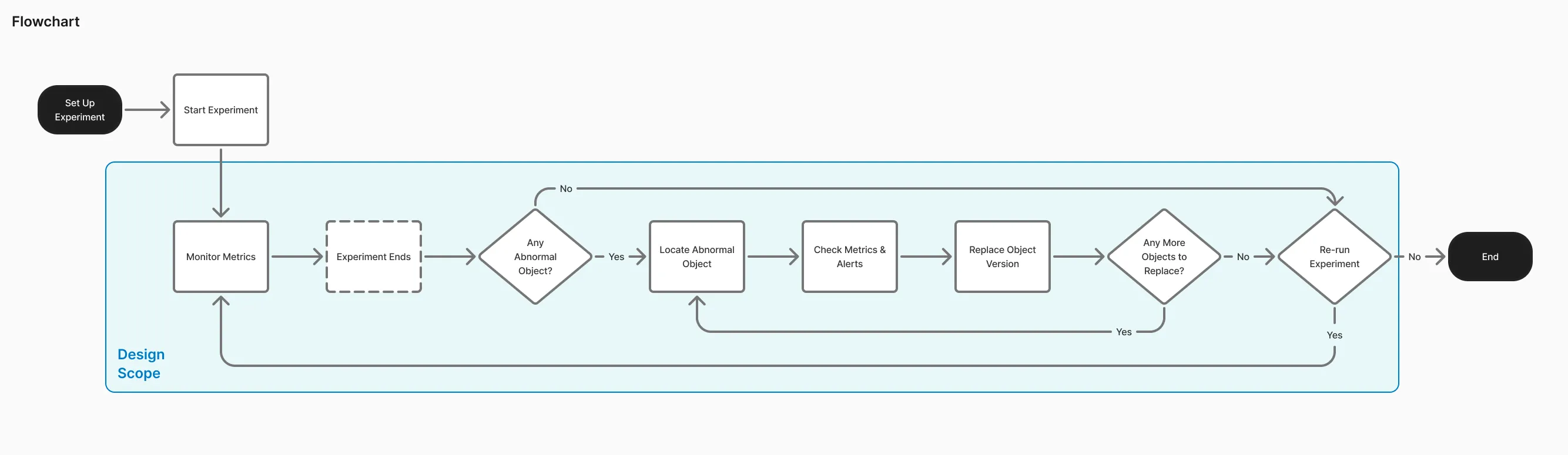
After spotting an anomaly, the engineer switches the object's version and re-runs the experiment. If the anomaly is resolved, the experiment ends. If not, monitoring continues.
Version switching sits in a modal, which lists each version's information and marks the version used in the previous run. Once an engineer applies a version, the interface shows that a new run is needed to get results for it. The previous run's results stay available to look back at.
Figma design file (opens in a new tab)
From Design to Development
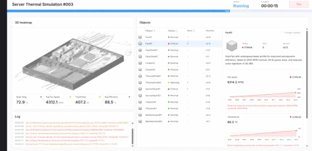
Once the design was done, I extended it into an interactive prototype built in Vue, as frontend practice and to verify the feasibility of implementing this design logic.
During implementation, I focused on architecture and logic, using AI assistance to speed up the actual coding. The architecture has four layers:
- Component layer: Vue 3 + Element Plus, components never touch the data layer directly
- State layer: managed with Pinia
- Service layer: simulates the backend API
- Data layer: pre-generated mock data
The service layer is independent, so connecting to a real backend later only takes swapping out that one layer.
View interactive prototype (desktop only) (opens in a new tab)
Learning and Reflection
After finishing this design challenge, I collected a few points worth revisiting in any monitoring scenario, not just this simulation case, as reminders for myself:
- Reduce cognitive load: with a large volume of information, use structure and layout to guide the eye and avoid clutter.
- Shorten decision time: keep the information needed to judge an anomaly within one view, cutting down on switching back and forth.
- Prevent accidental actions: mishandling a monitoring system is costly, so it needs the right safeguards.
- Consider where automation should sit: a deeper question. The more automated a monitoring system gets, the weaker a user's response to unexpected situations can become, and design needs to balance the two.